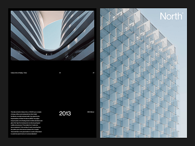
North Architecture Layout
Balancing image and typographic elements in a pleasing yet formulaic manner can be difficult at times. Adhering to a strict grid layout is fundamental, but things do have the tendency to look sterile. In this case, with limited elements it runs the line neatly on what's functional without being overly mundane.
Any thoughts on simple layouts? Let me know.
More by O-Y View profile
Like
