Fundamental 2009
The Name and Logotype: The name Fundamental was derived from the the words 'funda' and 'mental'. It represents idea generation, thinking and craziness. The two words are the opposite characteristics of designers in general as well as the principles which define the fest.
Every year before this, the logotype was split into two parts i.e. Funda-Mental with a physical division. Due to this, the name of the fest itself got lost and the logo was not readable as 'Fundamental'. This effect was further strengthened by the tagline "Every funda has a mental side."
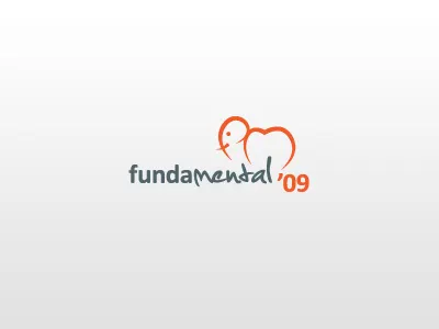
We faced the task of maintaining the old separation between 'funda' and 'mental' while still making the logo readable as 'Fundamental'. This was achieved by separating the two parts of the name using complementary typefaces, while maintaining readability of the entire word by unifying it with a common color.
The Symbol: Previous iterations of the Fundamental symbol consisted of two elephants representing 'funda' and 'mental'. In each case, these elephants were also meant to look like the three letters 'fdm', the abbreviated form of Fundamental.
This year, the unification of the two parts of the name of the fest needed to be reflected in the symbol as well. Two elephants turned into one and the 'fdm' abbreviation was changed to 'fm', the head of the elephant representing the 'f' and the body the 'm'.
The Colors: In previous years, the colors used in the logo were either analogous or monochromatic. Neither of these color schemes accurately portrayed the two opposite characters associated with the fest.
This year, along with the meaning of the name, the theme of the fest also demanded the usage of colors that can be easily differentiated from each other and ones that invoke the opposite feelings defined by the event groups; Hence we felt the need to use complementary colors.