Ecommerce - houseplant
Hi all 👋👋👋
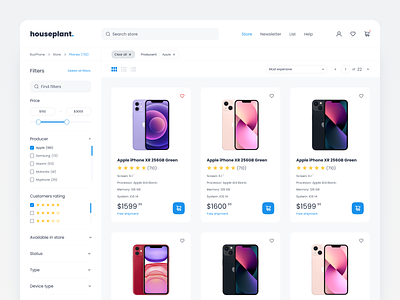
I would like to introduce you to my second shot which presents part of the concept of an E-commerce website with phones. As I mentioned before, minimalism is important - stores must be legible, not cluttered with many things (promotions, offers, sales in the form of slowly showing popovers), filters should contain as many options as possible (sorted by the most important and most frequently chosen filters), which they update after pressing the selected filter. The combination of white, blue and its shades can produce really clean, pleasant and eye-catching results.
Your support is crucial to me. I appreciate all the likes and comments! Feedback is greatly appreciated.
Have a nice and productive day! ❤️
📧Would you like to talk about your project? Let me know: wojteklyzwa@gmail.com
