California Fair Plan :: Resources
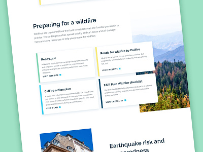
The California Fair Plan website housed a lot of resources and information that needed to be navigable and easy to read. Arranging topics into a card format helped to organize the voluminous content, providing enough information to introduce the subjects without the layout getting cluttered.
One technique we used to make the cards seem less visually repetitive was to vary the colors of the left edges, choosing from a selection of tones within the CFP brand palette.
—
Does your website need a facelift? We would love to hear about your needs. Email us at hello@llt-group.com
More by LLT Group View profile
Like
