Brand Identity: Canyon Springs
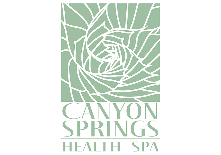
The client for this project was Canyon Springs Health Spa, located near the Grand Canyon. They needed a complete branding overhaul, as well as some updated packaging for some of their products. I chose to use a calming sage color for their logo because it's reminiscent of the natural beauty of the area, and feels refreshing and clean. The pictorial aspect of the logo is an abstracted illustration of an aloe plant, as seen from above.
