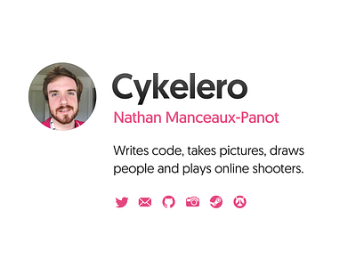
cykele.ro
My personal website, cykele.ro.
Even though the final version looks kind of obvious, as someone who's not trained in design, this was pretty hard to get to!
I wanted something that wasn't too reminiscent of a given era of design, that couldn't easily be pinned down. But, I didn't want to try and make something completely original and crazy, either, because I probably couldn't pull it off.
It took a lot of different revisions, and then a lot of refining to get there. (the second image shows a lot of the exploration)
The font is geomanist from atipo foundry. It felt like the right balance; not too bland, not too crazy.
I redrew the Steam and Overwatch icons so that they'd be sharp on @1x screens, and made the mail icon and the camera icon.
More by Nathan Manceaux-Panot View profile
Like

