Takl Case Study


Takl 1.0 was built externally by an agency and brought in-house shortly before I came on board.
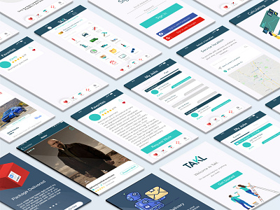
The first thing I did was build a Design System, as their brand guidelines only applied to marketing materials. The second step was bringing Android, iOS, and Web in alignment from a layout and functionality perspective. Certain actions were only available on one platform or another, while others existed on all three but behaved very differently.
Next we overhauled the UI. Starting on Mobile and then expanding to Web, we adopted a streamlined process reduced the number of screens in a given workflow from roughly 18 down to 6. We also transitioned from a stock-photo based aesthetic to a cleaner, Vector Illustration design that I created by hand from scratch.
A status tracker for in-home deliveries. The truck is a PNG that will have a package loaded into its bed and slowly drive the route to the customers house as the bar at the top changes states. The color scheme is based off Brand colors.
Depending upon the item size & quantity, different vehicles or trailers would be required. Since TAKL is a 100% user-based service, Providers would have to upload photos and details about their vehicles in order for our back-end system to filter out anyone who is ineligible for the delivery based on available cargo space.
Need to get in touch with a customer or cancel the delivery? Contact cards are required.
Who should I choose to come do a chore for me? Let me check out Walter White's profile, which can be swiped through or expanded. I can also favorite him for easy access later!