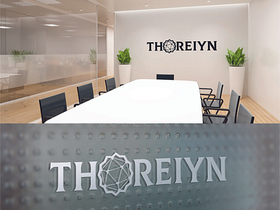
Logo for "THOREIYN" company
Logo Design Brief
Client needed a logo for a global growth asset management/private equity company called "Thoreiyn Group".
My Work & Ideas
Thoreiyn means Durian (the fruit). The client wanted to communicate sophistication and adventurism in their new logo. In the same time the logo must look clean and modern so i mix poligonal graphic and bold lines to made this logo looks stable (becouse company work with money of their clients) and with sicret inside.
More by Antonina Kuzhym View profile
Like

