#031 Medcenter
Today I came across honey. site that I did not like visually. The overall picture is good, but the typography suffers a lot and kills the visual. Therefore, I decided to make an option on this topic, and not from the position of UI, but from the position of UX. I had an idea to implement the convenience of a landing page based on a multi-page. Therefore, you need to look at it as a prototype, and not a ready-made solution. Today I did not have time to make a good and well-developed solution in terms of visuals.
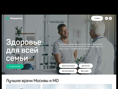
In the pre-project preparation, there were many ideas on how to implement the first screen, and the initial solution was to divide it into a header (full of points and contacts), a banner with a slider, and further block structure. But, as it seems to me, the first screen can be implemented through this format.
In a nutshell, I decided to unload the header, which is always loaded on such sites, and give all navigation within the first block. Of course, it didn’t reduce the number of clicks, but it simplified the user’s perception and contact with the service. And you thought I was just drawing some garbage here without logic and meaning?
Why? Because the main directions of the clinic are immediately shown on the first screen, like the call button. Now, I don't like the "dirty" background of the first screen and I want to "play" with them to achieve a clean picture and contrast for the text. There are many options on how to beat, but time was running out.
Do you remember that these are decisions in an hour?