GetWell – medical appointment platform
👋 Hi Everyone!
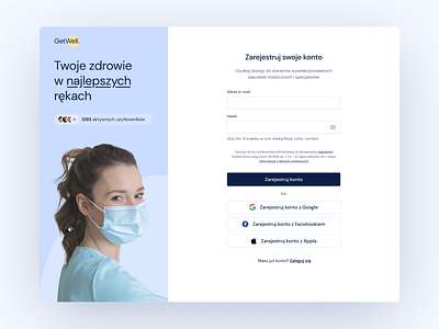
Today I'd like to share with you a GetWell registration page. I created this concept as a part of my take home assignment. Here is the final UI style proposal. Here you can find a link to the prototype. Hope you’ll like it!
🤔 What is GetWell?
GetWell helps young people by providing easy way to book appointments with a clinician. It is a product aimed at young, tech-savvy people who prefer app solutions rather than traditional booking medical appointments by phone. My assignment was to design registration and login page flow to create a good experience.
👩💻 How I solved this?
I started with understanding the main goal, which is to access the service without friction. I kept in mind that a somebody booking a medical appointment may feel unwell and tired, so can be more error-prone due to their condition. Therefore flow should be simple, reliable and useful. I designed a clean form with a proper validation, and offered two ways to create account: traditional with an e-mail address, and second via social media which is a time saver.
Next I came up with UI style. I focused on simplicity and legibility. I went for modern and legible typography, therefore I have chosen DM Sans for this project. It is a beautiful modern sans serif typeface – legible in small size. The colour palette I created is based on shades of blue, since blue is associated with trust and professionalism. I have choosen pastel tint of blue in the background for a calming effect. At last, on the sign up page I decided to add graphic – a photo of a doctor to complement the claim text, and to enhance trust.
Thanks for stopping by!
Yours,
Anna
