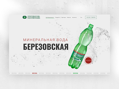
Mineral water Berezivska
We tried to design the main page in such a way that it reflects the direction of the company's activities, and the visitors can easily find any information and easily go to the section they need. The design was made in light shades for easier figuration so that the site pages do not look overloaded. Implemented a block of company news with interesting and useful information for the visitors.
First, we analyzed the trends in the market. Our main goal was to design the main page in such a way that it reflects the direction of the company and make the site easy to use. The design was made in light shades for easier design, so that the site pages do not look overloaded.
More by imarisua View profile
Like
