Wordle Wireframe / Sketch
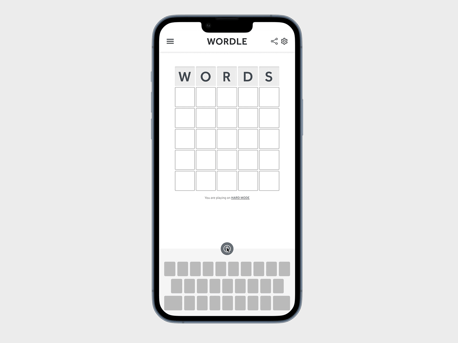
Created a quick wireframe for this one after asking my family group chat what changes they'd like to see from the Wordle! The biggest flaw for me is the share button being tied to the statistics button, especially since sharing my score is a major part of the experience. Somehow it always takes me a beat to remember how to bring the share button back up after I play. I decided to tuck the stats into the settings menu (it could also work in the regular menu).
My partner has a disability which affects his ability to read and write, so having a feature to read would be a huge bonus for him. I opted for a humanist sans-serif to make reading the site a bit easier and added an accessibility button right above the keyboard. There's also a Pattern Theme to toggle on which utilizes patterns instead of color. From what I've read, this is more universal for those who may have color blindness as there are many different types of visual impairment.
This challenge was really fun and there are so many small things which could be done to the app to make it even better! Although if the NYT keeps putting in these difficult words (caulk!?!), the UI/UX may be their smallest problem. 🙃 Thanks for reading!

