Logo Redesign Concept- The DoughBoys
"Sometimes details are worth it"🥮🍕
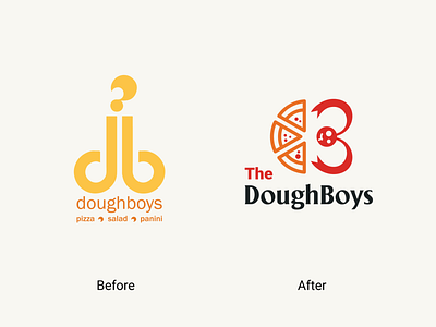
Logo Redesign concept for "The doughboy".🥪🤤
Don't know how to say but honestly their original logo looks like a penis to me.😳🤮
So I can't wait to redesign that logo.😌😌
Concept was to combine D + Pizza + B + Person with🤤🙌
Let me know if you like this??👂👂
Like and share if you care.💖💖
▪️ Available for work
▪️ My portfolio link Click here
▪️ Please show some Support & follow for more
Have a great day!! 🤗🤗🥰🥰
