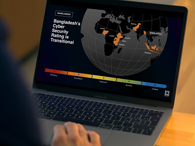
Global Cyber-Security Infographics
PowerPoint and complex Data Visualisation to illustrate statistics clearly for a Cyber Data analysis organisation. We used a heat map with bright colours, to represent the numbers 1 to 5 – which looked great on a dark background, and along with white lettering provided an eye-catching and clear design. Produced on behalf of the Gates Foundation.
These are example images only, and are not final data
View all tags
Posted on
Feb 21, 2022
More by Rob Castles View profile
Like

