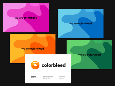
Colorbleed business cards
Hey guys,
I'm exploring some branding directions for colorbleed and here is one of the business cards concepts.
I have noticed that the negative space of the logo looks very fluidly, and I decided to use it as a secondary branding element.
Happy to hear your thoughts about this direction.
More by Wegrow View profile
Like
