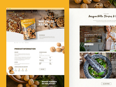
Seeberger Corporate Website
Hi,
Hi,
During my time as a freelancer at PLUSPOL interactive, I designed the new company website for Seeberger. Their customers are hardly divided into 2 groups: B2B (nuts and dry fruits) and B2C (coffee and tea). Offline they didn't really have touchpoints, but online the challenge for us was to connect both worlds in one domain.
So we created two worlds with different looks to show the products and use different push and pull functions to get the attention of the user. Both worlds got different colors, components, and language, but are connected with the home, company, and legal pages.
The magazine we created to give the clients extra services and to add positive value to the Seberger brand I will show in another shot.
➡️ https://dribbble.com/shots/17554855-Seeberger-Magazine
Happy to get your feedback in the comments! ❤️🤩


