Wordle Redesign

The first time I played Wordle, I found that it was easy to understand, so the user experience isn't bad. I did noticed a few things that I thought could be better, such as:
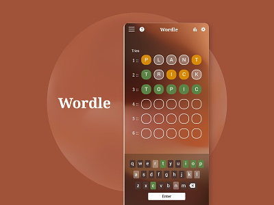
All the squares look a little intimating at first, but then you notice that it's for the 6 different tries. I decided to space them out a bit more and label them so that it's easier to read.
I was looking for the "Enter" button, as it was placed on the left side, which is not the typical placement for that button on a keyboard. To make it easier to find, I designed it more like a submit button than part of the letter section of the keyboard.
I wasn't sure if I was supposed to click on squares where the attempts are shown, so I created a more distinct separation between the keyboard and the answers for a clearer hierarchy.
Your thoughts and comments are appreciated, thanks for watching!