UX Copy: JCPenney
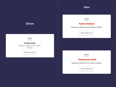
Rationale: On the Credit Card banner, the order of the copy could be changed in terms of priority.
As a customer, I assume, one would like to see the benefit first, in this case, ‘faster checkout’ before the user gets to the see details of how to do it.
New headline: Faster Checkout
New microcopy: Save your credit card and checkout in a flash.
More by Ruben View profile
Like
