App icon - Daily UI 005
I tried to do something different for this one: I found interesting posts on medium about daily UI:
https://medium.com/art-of-empathy/daily-ui-004-ece50f704113
The person in the post create some sort of briefing before designing the solution for the daily challenge. This reminded me that, design must be intentional, it's not just about good looking screens. The objective of the daily UI is, of course, to get better at creating visually appealing designs, but, I found a good way to try to practice "real world design". I don't have a design process wet, so I tried to mimic what I read in the post. Here is what I got:
It's an app for what?
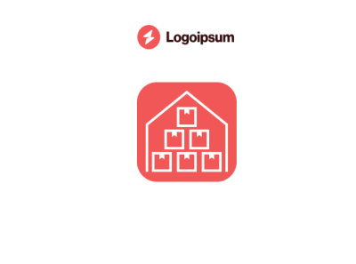
It's a warehouse management system.
What is the context? Where will the app be used?
On a company's mobile devices
What is the logo of this company?
A red circle with a white symbol in the middle (like the one in the image)
I just asked the questions and answered with the first thing that came to my mind (also, I chose a random logo). Based on these constrains, I started designing the solution:
The background color is red because of the company background. The icons are simple white outlines, also to resemble the logo. Boxes inside a house = warehouse. I tried to make the boxes and the house with rounded edges (to resemble even more the logo), but it looked really bad.
Well, that's all for today. I hope you liked it :D