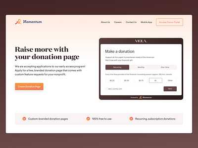
LendingPage Design for the new Startup "Momentum"
I needed to create this page using ready-made branding, images and icons. But the branding didn't match the task of the site. This website is for Donation, and it has to be warm, pleasant, simple, functional, and understandable for users. I decided to soften colours using gradient and warm shades of colours from the style guide. Also, there were very sharp fonts earlier, so I've changed them to smoother ones. I decided to offer the client to adjust branding to receive pleasant emotions from the site. Then we got the desired result.
More by Yikes View profile
Like


