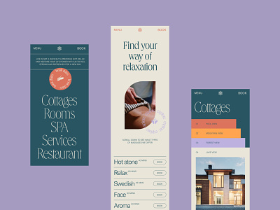
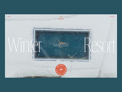
Spa Space Mobile Website
Relaxation and restoration are vital for staying strong and productive for all facets of life, and our new web design project is up to share that vibe. Here’s another glance at the website for the spa space. It uses a tender palette, sophisticated typography, eye-pleasing photo and video content, and smooth motion to impress visitors and immediately set the atmosphere, while the well-thought-out content organization helps to find all the needed information with no effort. Here's a look at how it looks on mobile. Stay tuned to see more!
Also, welcome to check:
• the huge set of design concepts for business
• the big collection of our design case studies
• the UX practices of product page design
• the tips on how to reach design consistency
• the insights into aesthetic-usability effect in UX design
—
Tubik | Tubik Blog | Behance | Instagram | Twitter | Facebook

