✍️Professionals
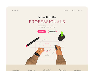
Design Agency homepage
3D ✍️ header illustration has a construction / architecture feel to it. Also accompanied with the copy, as it's a popular catchphrase = leave it to the professionals, and "professionals" emphasized with the help of alternate color and font (typeface).
This makes the communication concise, easier to grasp the intention, exudes trust, and reliability.
Overall highlighting the brand's tone and voice.
Hope you like, Feedbacks are welcome.
Thanks for the support ❤️.
Contact: amadi.augustus@yahoo.com
More by Augustus View profile
Like
