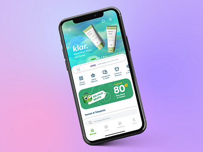
Thumb Driven Design - E-Commerce Design Exploration
This shot is born from one question: How might we make the navigation in e-commerce apps more accessible?
There are today more than 30 million Indonesians who purchase online, creating a market worth at least US$8 billion. E-commerce has certainly had a substantial impact on the country. Smartphone penetration has also more than tripled in recent years, it's not wrong when Google itself declared Indonesia as the new frontier for mobile marketing.
As our phones have recently ballooned in size, most of the places that were easy to reach are now difficult. In this shot, we want to frame our approach as thumb-driven design, backed by a study done by Steve Hoober, who discovered 75% of users touch the screen with only one thumb, hence the thumb-driven design.
As an example, we have reimagined Tokopedia, Indonesia's most popular e-commerce app and reimagined it with thumb-driven approach. Getting to the navigational elements is easier with the thumb near the top, and the less-important items (such as messages and notifications) stay at the top.
Consequently, searching and navigating are now faster, since the navigation bar is less crowded and only contains the most important items for user key actions.

