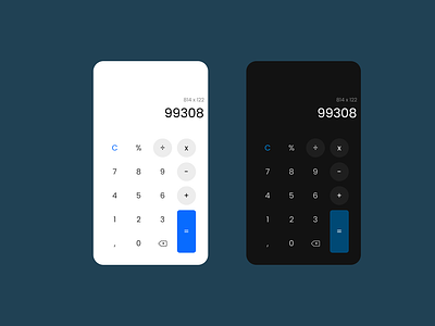
Calculator - Daily UI 004
Today was a hard day, a little bit late, but I did it :D
This one looks simple, but was a little bit hard. The buttons act like a primary (equal sign button), a secondary (math operations) and a tertiary button (the "C", for clear). It took me a while to realize that, and I just threw colors randomly onto the buttons, and the result was always awful.
White space plays a big role here too. In my first tries, I tried to occupy all the horizontal space, but the keys belong to the same group, so spacing them too much created a strange feeling in the design.
And, for the dark-themed one: colors that are too bright don't look so good in the dark. I changed the color of the primary button. The tertiary button was too hard to read, so I increased the brightness a little.
I hope you like it :D