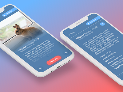
Profile Page: Fuzzy Rabbit Adoption App - Daily UI 006
As part of a design challenge, I conducted a three hour case study around a fictional company called Fuzzy Rabbit Adoption.
The purpose was to encourage more people to adopt rabbits by creating profile pages for the rabbits on their website. Some provided insights for the challenge revealed that a majority of users access the site via mobile devices. Potential adopters also want to know more about the rabbits, and often find it overwhelming to make the decision to adopt a rabbit.
After a brief competitor analysis, I decided to merge the idea of dating profiles with the transparency of traditional pet finding websites like petfinder.com.
I truncated my design process into three stages, and did one stage per hour:
1st hour: Immersion - Empathizing, defining, & early decision-making
2nd hour: Ideation - Thinking creatively outside the box, divergent, & flows
3rd hour: Prototyping - Building wireframes and profile page mockup, reflection
My final reflections:
I wish that I had more time to conduct qualitative research, in order to think about accessibility, as well as other aspects that go into the rabbit adoption process.
I would also like to test my final designs on potential users in order to gather feedback for the next iteration.
By researching into this problem space, I learned more about the intricacies that go into rabbit adoption. I also learned that by limiting how much information is shown at one time, we may encourage people to make a choice quicker.
-
Moving forward with the UI, I would create a style guide and visual identity, provided that there isn’t an existing one.
I’d also like to think about opportunities for interactivity and micro-animations that make the website more enjoyable and engaging for users.
