The S/S

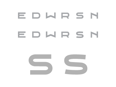
Ok. been working on a bit of a custom font (one of my first ever). Started it about 2 months ago. Haven't toched in several weeks and decided to pick it up again. Where I have hit a wall is with the S.
I can't decide which i like better. The font over all has very clean, straight lines... the left S mimics that... it has no curve in the cross strokes. Right, has a bit more curve in the cross strokes... still can;t decide which one I think fits/like better... thoughts?!