HODLIT Cryptocurrency Exchange Mobile App
Note: Make sure to click the image to see the larger size.
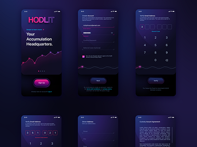
These are obviously not all the screens for Registration. One thing to note though, the wavy plasma lines below are actually a progress bar so the end-user has an idea where they are in the onboarding process. It's important to inform them as to their progress. This will alleviate frustration if the process has a lot of steps to complete.
iOS iPhone Application UI/UX Design
HODLIT, a cryptocurrency exchange platform, approached The Skins Factory to do a full redesign of their application's UI & UX design. We started with a complete refresh of their onboarding process and user experience. For the visual design, we used a “deep panther black” base background with washes of blue & purple, so the color gradients we would later add, would “pop” off the background, instilling a sense of fun while maintaining the seriousness of the platform.
Our creative agency used a hybrid, visual design language of 2D and neumorphic elements creating a subtle, tactile feel to the user interface. Be sure to check out the 3x versions in full view.
Get in touch with us:
Home | View Project | Contact
