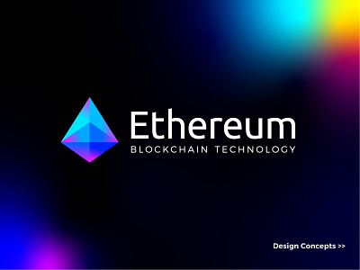
Ethereum - Logo Redesign Concept.
Ethereum - Logo Redesign Concept.
==============================
We almost all know about Ethereum. Currently, I have been noticed about the logo of Ethereum. I think the concept is good enough but it can be taken into next level as I have found some issues regarding the current design.
No.1 overall the shape seems like tall/thin which looks a bit weak/unhealthy (though they are wealthy enough :) ) from the good point of view of a strong and powerful logo.
No.2 It's been splitted into 2 parts which looks a bit weaken the strength of the logo.
I am not saying that are wrong. I am saying that could have done in a much better way by hiring some great designers. The current design has a nice story and concepts (pyramid and 45 degrees). I have read it in a blog. I have tried to make it simplified in one object with having the current feel and tried to keep a feel of Luxury and expensive stone. I have decreased the current angle from 45 degrees to 35 degrees based on the healthier look and feel. you can compare it on the 2nd slide. Don't forget to check the other slides as well. :)
Hopefully, you all guys would love it And don't forget to submit an inspiring comment and a huge love/like here.
==============================
Do you need some GREAT designs for your business!
Contact me through this email - hello@brandcraftmaker.com
or, projects4designing@gmail.com
Skype : maxdesigner-skype
==============================
Thank you!


