Landing Page - Daily UI 003
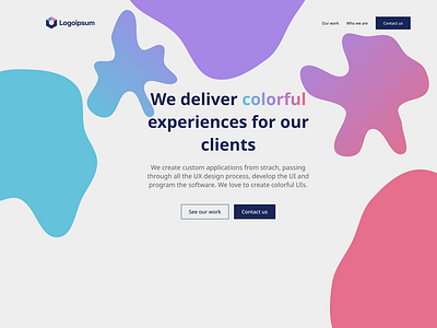
I don't like this one that much. This time, I decided to choose a logo first, and then try to create something constrained by the logo.
I chose the blobs because they are a good way to show the color brand without using a gradient as a background. It is possible to create a gradient-like effect (the blobs in the extremities and in the middle are solid colors, and the two blobs connecting them are gradient).
I used blobs this way because I couldn't find a fitting image, so I centered all the text and buttons.
It looks like a lazy design, but, given the number of tries in creating something, I think it's a good amount of work for today.