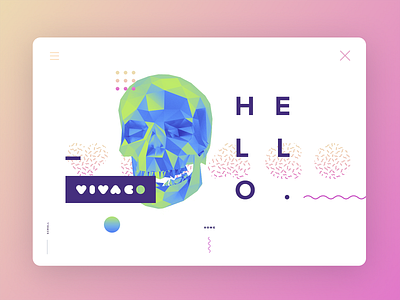
Skull Landing Page concept
This one I found the other day, it's an early concept for an agency landing page back in 2017, I don't know why but I kinda like it now (but I didn't in 2017) 🤷🏼♀️🤔
The skull was supposed to move in 3d and follow the mouse, and everything suppose to ease in and out and stuff... too bad it was a total time waster, why?
Because when you fulling around with composition you are almost never happy with the way how objects are placed, you think it can be placed better, and you are back to square one (and also this concept was too challenging for our devs in the time lol)
More by lazymau✨ View profile
Like
