TAB homepage updates
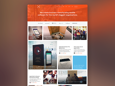
Spent some more time this week on the design for our new site, specifically focusing on the homepage content grid.
I've tried to make it more interesting by breaking up the grid with different sized content blocks, as well as spots of white space (which are blog posts that don't have an image). The grid will now be fully responsive and have a continuous stream of content as the user scrolls down.
More by TAB (The App Business) View profile
Like
