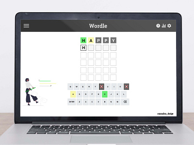
Wordle UI/UX remake
Mostly accessibility improvements (colours don't pass on the original)
A more clear mark-up of the wrong letters
Moving the help button to the left along with the other buttons
Background on the tiles of the row you are working on
Nice little drawing to cheer up the page :)
Done on Adobe XD
More by Andrea Araujo View profile
Like

