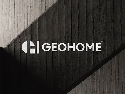
Geo Home Logo & Brand Identity Design
GeoHome Logo & Brand Identity Design
GeoHome is an architecture business that is regarded as one of the greatest in the city of Toronto. It provides a variety of services, including architecture, planning and master planning, and interior design.
The symbol was created by combining their two initial letters " G " and " H " to create something smart, original, and pleasing to the eye, while utilizing negative space to envision both characters.
With a branding that exudes seriousness, innovation, and a sense of connectedness to nature.
Let me know your thoughts?!
Thanks!
Get in touch with me:
contact@secondeight.net ◆ www.secondeight.net ◆ Instagram ◆ Behance ◆ Twitter
More by Sam Hox View profile
Like


