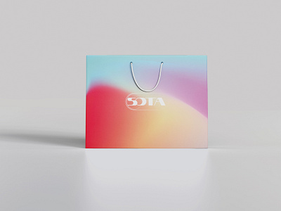
Identity design for for the Sota store
The Sota store sells modern technology such as phones, laptops, headphones, etc. The logo was based on the swipe button. The font was chosen following the same approach. The letter "O" is drawn in the same way as the swipe button. In the compositional solution of combining the logo and the font, I made it so that there was a transition between the graphic logo and the font. With the help of a gradient, the small circle passes and dissolves into the letter "O". I further developed the logo in identity using color gradients. In the first version, I used white for the font, which was overlaid on top of the gradient. In the second version, I rendered the logo itself using a gradient. Why was the gradient chosen? I decided to portray the world of technology as digital art. How to do this without using already existing examples of branding? Use associations. When considering this project, associations appeal as the fastest development of technologies in our world. The main idea of creating an identity was to show the rapid development of technologies. Swipe from the old world to the new. This moment with the swipe button can also be used when creating commercials. Move from push-button telephones to modern ones.
Trends 2020-2022 WGSN
Trend: Game Scape
Details: https://www.behance.net/gallery/123089711/Sota-storebranding
