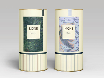
Tea packaging design MONE Art capsule Claude Monet
Identity design of tea packaging. This packaging branding refers to the art capsule. The main idea for creating the packaging was the decision to use Claude Monet's paintings, but not directly. Were selected 4 paintings which, in terms of color, can be attributed to some varieties of tea. The painting Boat, Claude Monet, 1887 has a green tint in the main color, which means it has a color association with green tea. In order for the product to say indirectly that this collection is dedicated to art and to Claude Monet himself, fluid art was created from his works using Photoshop. Other tea packages from this collection were created using the same principle. Also important is the font used in the names of the teas. The dynamics of the font echoes the composition of fluid art.
Trends 2020-2022 WGSN
Trend: Game Scape
Details: https://www.behance.net/gallery/127398333/Tea-packaging-design
