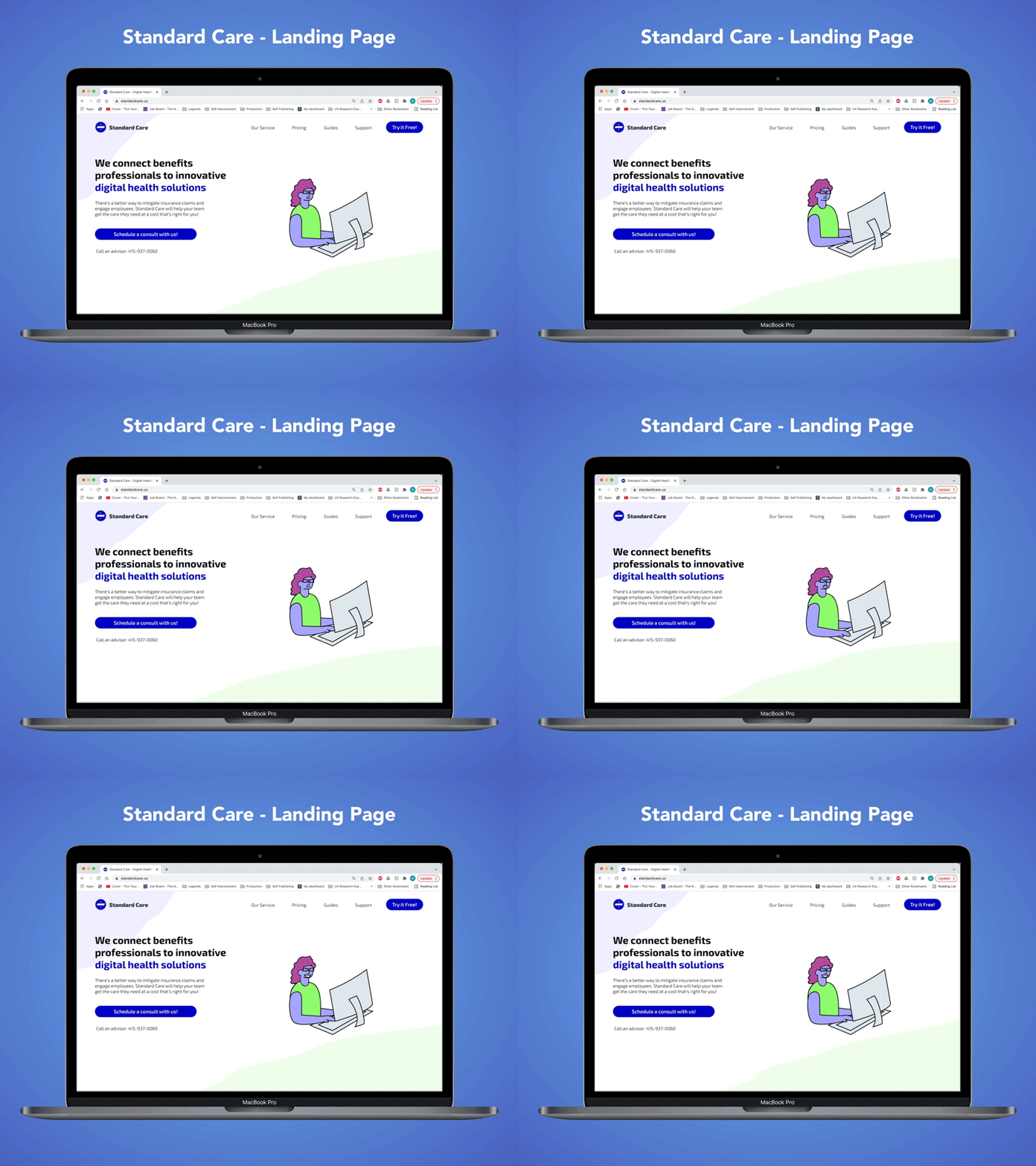
Standard Care - Landing Page Redesign
For my third Daily UI challenge, I redesigned the landing page for a small start-up company that I did some UX work for.
I created some animations that play off of the website's color scheme, and I used the font family of the logomark throughout the page for cohesivity.
Standard Care is an online marketplace and resource for benefits professionals to find and manage their digital health solutions. I redesigned the landing page so that it would be more engaging and understandable for new users.
More by Will Gilligan View profile
Like
