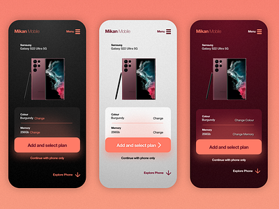
Concept Mobile product page
Playing with some colour variations and possible UI options for a Mobile phone product page.
Tried to keep options minimal, But may need to look at how user could view different angles or zoom, as well UI for change specs
Aimed to make colour contrast accessible, using shadows on type to help boost the contrast where it was borderline accessible.
More by Andrew A'Court View profile
Like
