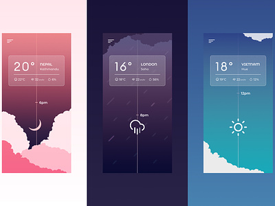
Day 10: Weather Card
Day 10 Weather Card
I wanted to play around with gradients in this one and also try out a new illustration style. I like the dark overlay on the gradients cause it gave a darker vibe to design. To not overwhelm the user I stuck with a friendly icon design from feather icons. Overall a fun experiment!
More by Riya Shrestha View profile
Like
