Sign up - Daily UI 001
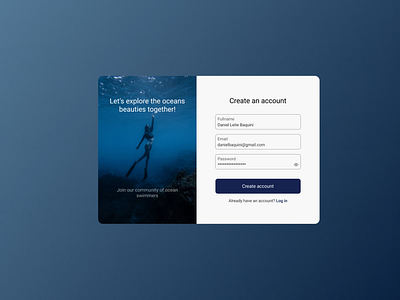
Learned a nice trick in this shot: I chose a dark primary color and because of that I also used an image with a lot of black and dark blue.
The login was not full-screen, so, I needed a background color. Using the primary color as background color would be too dark and using a solid variation of it also didn't look good.
That's why I used a gradient. I can use one darker variation of the primary color on one side (on the bottom right, creating contrast with my form) and a lighter variation on the top-left.
The contrast could have been better, but, I was unable to find a variation that looked good with the image.
Hope you liked it :D