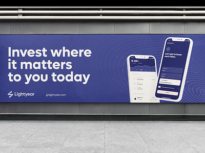
Lightyear - Patterns
Hi all,
I'm thrilled to share the brand identity developed for Lightyear.
Strategy
For too long investors have been getting the short end of the stick. Limited access to markets combined with high fees have put ordinary investors at a disadvantage.
High barriers to entry mixed with abstract concepts and opaque language have created a financial system that thrives on fear and confusion — asking people to surrender control of their money with little transparency in return.
Lightyear is here to change that. And make it lightyears better.
Brand Identity
The ever expanding world of financial markets offers almost unlimited possibilities for investments.
Lightyear's visual language reflects just that - portrayed as an ever expanding universe with many systems, objects (companies) and orbits.
The center of each system is an individual user, who is able to see the big picture, educate himself/herself and invest into companies based on his beliefs.
The result is a visual language that is product-driven, scalable and universal.
Lightyear is hiring designers! For more visit careers.golightyear.com
To learn more about me follow my Dribbble or Substack or check my Linktr.ee


