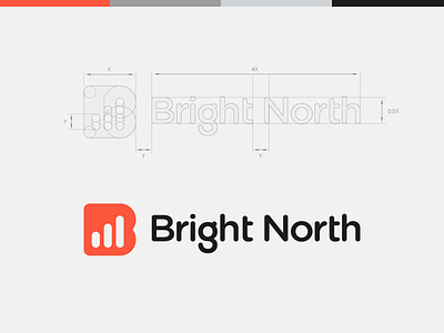
Bright North Brand Identity / Logo Design
Bright North features a unique blend of design and science, dramatically increasing each of their clients business performances. The company is focused on enabling their clients to maximize revenue throughout a personalized customer buying experience. Samsung, Sky and The Guardian are just a few biggest brands in the world among many others that Bright North has helped become more efficient.
The data chart is a key symbol to Bright North. It is what they stand for, it is what they believe in. Thus the graph icon was combined with the form of the letter 'B' in order to achieve a meaningful and recognizible brand mark. The logotype was created in colaboration with their own in-house designer.
Don't forget to check out full project on Behance:
https://www.behance.net/gallery/18616275/Bright-North-Identity
