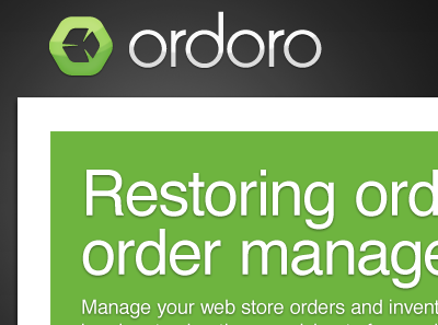
Ordoro Home Page Mockups
Presented these two home page UI design directions to the client this evening (full screenshots attached). They dug both but were really drawn to 01 (white, minimal mood), so I think we're sticking with that one. Very cool.
Also, they actually requested that I use Lorizzle for the dummy text, so that explains that. :)
More by Matt Omohundro View profile
Like


