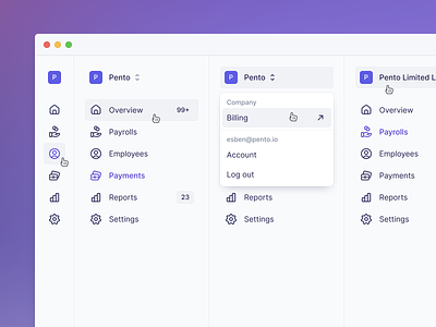
Sidebar Navigation
Hey 👋
We're hiring a Senior Product Designer! 👈
—
We recently redid our entire app sidebar and made changes to how you navigate within our product. Previously we used an approach of expanding/collapsing menu items within the sidebar to expose settings for the product area you were interacting with, but this made for a less discoverable navigation and made it hard for the user to jump quickly between processes and settings.
With our new sidebar we have consolidated all our settings in one 'Settings' page, allowing the user to easily find all options in a list and accessing them from anywhere in the product without leaving the process they are working on.
We also added a bunch of small details like duotone icons, allowing the user to collapse the sidebar, prompting for feedback via a "Give feedback" item and direct access to our help center.


