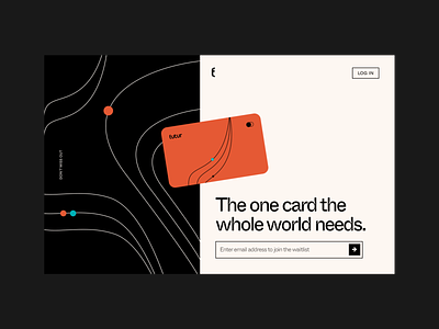
Futur Card- Landing Page Concept
Hello fellow Dribbblers! Here’s a concept landing page for “the one card the whole world needs.” We went with a black base for a modern and clean look. Lines play the supporting role; because who doesn’t like lines?
Hope y’all liked it.
💌 Have a NoCode project? Contact us at work@tuesday.is
More by Tuesday View profile
Like
