Webstacks Coffee Mug
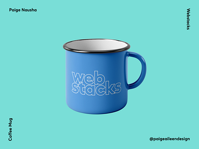
Rather than slapping the standard logo on a coffee mug, I opted to make a slight variation. I used the original font, but kept only the outlines. It took some time to decide on how best to overlap the two lines of text. In the end my design mentor and I decided to keep the overlap minimal. This design was inspired by a book cover I saw while on a trip a few weeks ago.
