Vent – Visual Identity


Hi guys!
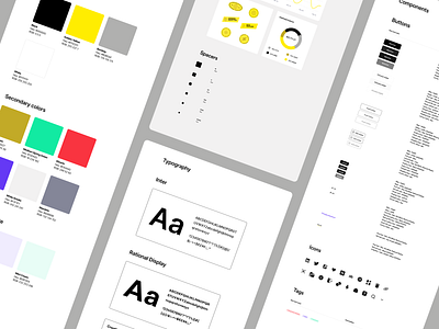
The branding we were provided contained yellow, black, white, and grey primary colors. Also, branding included Rational Display typeface, which needed another font to match with, and we decided the best option is Inter typeface. We used playful icons that match the typography and the overall brand. We wanted to ensure that the brand would not become too frivolous, so we used a simplified and professional approach to create balance. This project is very clean and straightforward. However, we found the space to make it fun because that is one of the basic values of Vent. We decided to spice up the empty states with minimalistic and fun illustrations.
Animated by @Karlo Stipic.
Check it out live.
Check our website at www.bazen.agency.
You may follow us on Instagram/Facebook/Youtube/LinkedIn/Behance.