Chatter - Messaging UI Exploration


👋👋
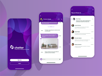
The aim of this exercise is to explore the design of the user interface of a messaging app with emphasis on simplicity and ease of use.
The idea is to create a clean interface, helped with liberal use of white space to facilitate information density.
We have reduced the use of labels and instead we are using icons to help users navigate the app and dots to help instinctively determine when other users are online, and to identify new messages.
We believe that clean, user-friendly interfaces unburdened with gimmick features are the way forward. What do you think? 😀
Press “L” if you would like to help support this shot! ♥