Linkedin Home Design

Here's my first shot! I've been wanting to get something up so i'm starting a series where I spend some time going through familiar web/mobile apps and put my twist on them.
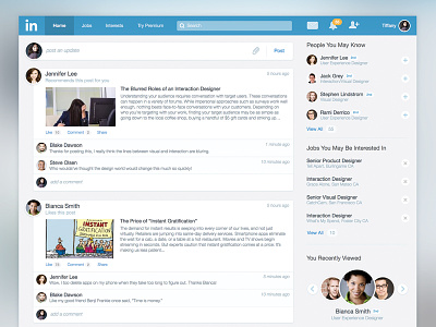
Here's my take on Linkedin's home screen (profile is next). I first started out by taking note of what seemed important from a business/user perspective and also noted current issues that I see in their UI today. I took a few passes on fixing the information hierarchy, redundancy of links and visual inconsistencies. I of course flattened out the overall design and tried to improve the visual hierarchy. Something to note is that I intentionally kept most of the app header elements but simplified it. Feedback welcome, please don't bite! :D
Enjoy!