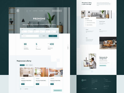
Prohome Estate - homepage
While working on this project from the begining I wanted to base it on a grid system which was later treated also as a decorative element of the site. Squares and rectangles in various configurations visible in the background help to organize the layout. This effect is additionally reinforced by two vertical lines defining the boundaries of the content.
__
Leave a 💗 and see my other shots
More by Aleksandra Janik-Przyborowska View profile
Like


