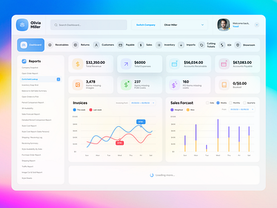
Dashboard Design for an ERP Software
Swipe to see 'how it was before'
The challenge was to create something more usable, accessible & aesthetically pleasing for the users. This is what I came up with. Working on the whole project now and will be sharing more work around this project soon.
Follow me on insta: @uxkasim
More by uxkasim View profile
Like

